
Many charts are included within different trading strategies, but now our attention is directed straight on the Renko chart. Let’s discover the principles of the Renko work to understand the most efficient way to use it.
- The exact definition of the Renko Chart
- Principles of work
- How to calculate a brick
- The interpretation of the chart
- Ways to use
- Renko Chart with trading
- Strategies
- Limitations
- Renko Chart usage example
- Renko & Heikin Ashi
- Benefits & Drawbacks
- Q&A
- Adjustment of the Renko Chart to the Thinkorswim
- Adjustments for the Tradingview
- Setting the Renko Chart’s box size
The exact definition of the Renko Chart
The Japanese created a Renko Chart which is based on cost change only. It is an exceptional type of chart that doesn’t include common time intervals. It is named Renko because of the chart’s appearance – it looks like a brick, which is “renga” in Japanese.
Such a brick is formed when the valuation moves a designated amount of cost and every single “renga” is positioned at a 45-degree angle (the direction is optional: up or down) to the right of the previous one.
Colors of these bricks are specified: white or green for up bricks and black or red for down bricks.
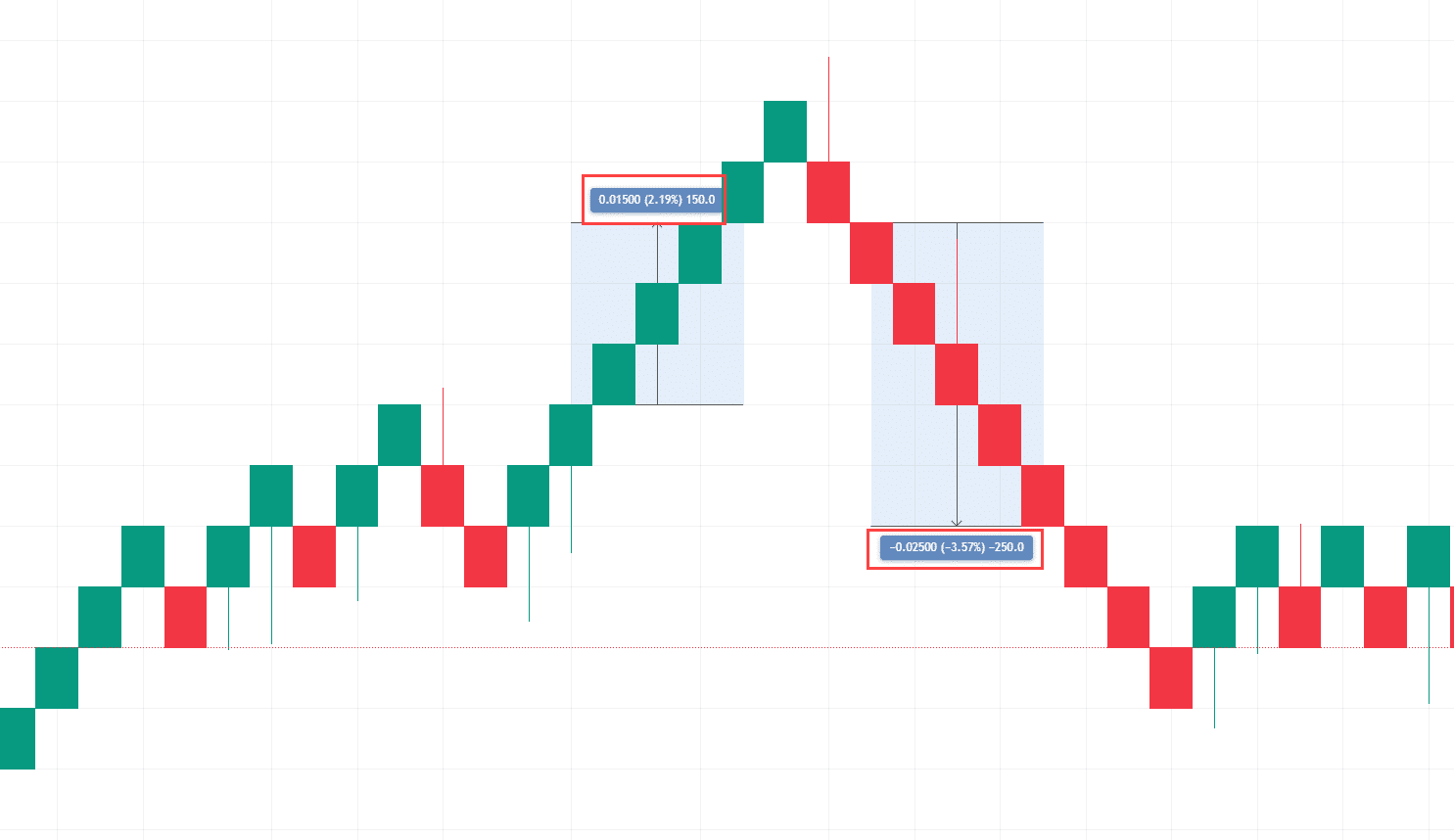
Take a look at visual example of such chart.
Principles of work
This chart works specifically within a user’s borders. The size of the brick, the sequence density and the observed time is fully under the viewer’s control. Of course, the new brick will appear only at a 45-degree angle, but the necessary value and time scaling of such brick is predetermined by a user.
This type of chart is indeed useful and can be applied within different situations. The ability to observe data of the cost for any financial instrument: stocks, currencies, treasuries and e.t.c.
How to calculate a brick
Let’s review several ways to calculate them:
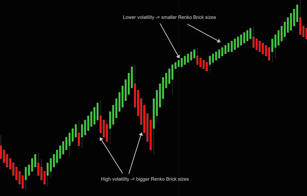
- Average True Range (ATR). The eponymous indicator generates necessary values. It is a beneficial way to calculate bricks because of a filtering ability: the volatility and small price fluctuations are under control and subtracted from the equation. As a result, we have a regular candlestick chart. Here’s an example of the ATR based Renko:
- Traditional. This is a fundamental way for a calculation: the user himself decides the value for a brick size. Chart building is based on this exact size: Only after it reaches the necessary value – the new block will appear.
However, this method requires experience, because it’s difficult to determine the optimal size of the block right from the start. Common target of a brick size: 1/20th of the instrument’s existing value.
Percentage (LTP). In this case, the size of such bricks are determined by the user too. The percentage is the chosen parameter. Its specific value is applied to the closest previous closing cost to measure the “renga”. After that, it is rounded to the closest minimum tick size. The preparations are now done and the defined value is applied to all bricks on the chart. This method is still yet to develop further.
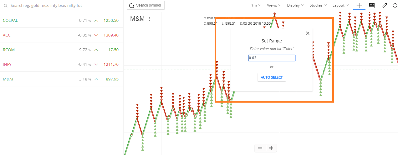
Here’s a visual example of the adjustment.
The interpretation of the chart
To understand the values of the chart you need to follow several steps:
- Acknowledge the basis of the tool. The principle: this chart is built using bricks which stand for a fixed cost change in the underlying asset.
- Adjusting the “renga” size. The right choice of size is crucial in the result. Don’t forget about volatility. The principle is simple: larger sizes means less brick on the chart and, conversely, smaller sizes means a more detailed chart with a bigger quantity of such “renga”.
- Trend identification. The continuous movement of these boxes in the same direction means the domination of one side of the market and the overwhelming power of the current tendency. The other side occurs in case of different directions: the trend is not constant and stable. Take a look at the visualisation of the trends with the Renko:
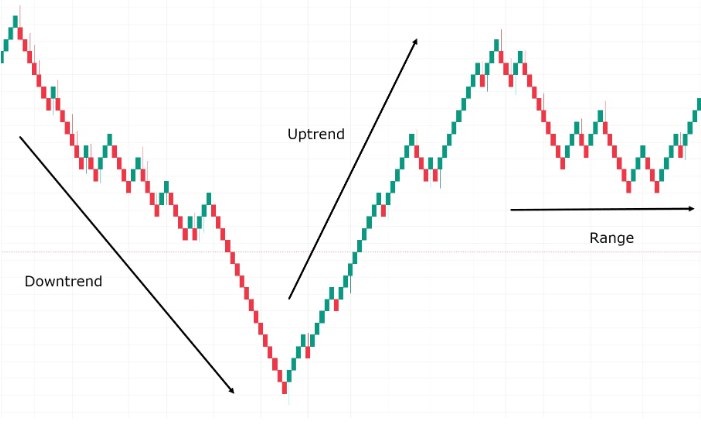
- Be aware of reversal signals. Finding signs of a potential reversal is crucial in trading and this chart can help you to identify such. If the box changes its direction – the potential reversal may happen in the nearest future.
- Adjust the usage – add more technical tools to improve the result. It is a compatible instrument and can be fulfilled with the data from other indicators which, later on, can add a crucial knowledge about the potential price changes.
Ways to use
All-in-all, Renko chart is an efficient tool in the trading. Let’s review the specifics it can uncover for you:
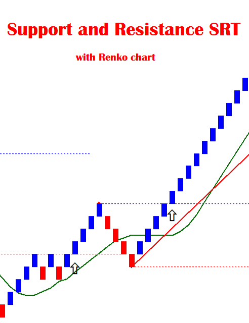
- Support/Resistance levels. During the usage of this instrument, trading ranges uncover themselves at the time of the bars generation, because they appear between such levels.
- Breakouts. It can be shown as a generation of the bricks right into the defined direction between the support and resistance levels which could mean a potential breakout.
Take a look at the visual representation of the support & resistance levels with the breakout:
- Determining an Overbought/Oversold condition of an asset. In cooperation with RSI, this chart can help to identify such situations.
Even though it is not the precise price calculator and doesn’t show the exact value of the asset – you need to remember that. Be sure to use additional instruments to improve the result of the observation.
Renko Chart with trading
This type chart is a very efficient tool to identify existing trends and to trail stop-loss. The choppiness and constancy is viewed on the chart by the direction of the boxes.
However, this tool is indeed useful all-together with different indicators, especially in case of price action analysis.
Strategies
Let’s take a look at several strategies which include the Renko Chart:
- Renko chart scalping. As all scalping strategies – it is based on profiting from the small price fluctuations during a very short time frame. Such trades can be executed multiple times throughout a day.
However, this chart is not exactly the best option with a scalping, because it doesn’t provide precise timely data. Only in case of small time intervals (30 minutes or less) market players can apply “renga” to be useful enough for the scalping strategy. In that case, bricks will uncover small tendencies and signals which will be enough to perform trades on that scale.
- Renko swing trading. This is a more efficient way to operate with the chart. Traders who decide to trade within trends can use Renko charts to hold the desired asset until a visible significant reversal.
For instance, if the cost is rising constantly, brick’s color will be green or white. It shows a positive tendency. It will continue until a reversal of a specific size. This is the point where the market player steps in and prepares to exit the position. The size of the reversal must be calculated before by the trader himself.
Within this strategy, people often follow different signals of potential breakouts which is an indicator of possible exit of the long-term trade. Renko Chart shows such breakouts.
If the valuation keeps scratching the resistance level without a breakout, market players could enter a short-term position until the price levels will reach the support level. And if the situation is a converse one: trade may go for a long position.
Limitations
Despite all the different benefits of this chart it has its own limitations. Let’s take a look at the list of them:
- Small time reliance. Single “Renga” can contain data for a long time frame without any small price fluctuations which can be as good for some market players as bad for others.
- The closing price usage. This type of chart doesn’t include highs and lows. It also reduces the amount of intel you get about the underlying asset. This drawback can actually misguide you because while the block is forming you can miss a significant price change. Later on, it could lead to several losses.
- False signals. The so-called whipsaw effect is introduced with changing colors of a brick way too early. This misguidance can result in a serious loss.
Renko Chart usage example
Let’s review a possible instance of applying the chart to the asset. In our specific case, let it be a $3 size of a brick. As we already know: all highs, lows and small price fluctuations will be out of the equation.

In this hypothetical example we can see a significant uptrend: the overall domination of the green “renga”. Even if there is a single red block, the next one becomes green again. It is a sign for a potential long-position trading model. Now you should be more patient and less greedy: hold your position until the first red brick appears. It is now your time to decide whether to exit or try to hold for a longer period of time.
In this case, you can think about a short-term trade. After a strong uptrend the red brick can form – it is a signal for an entering into a short-term position. This specific situation will be developed by the next green “renga”: it is a signal for an exit.
Renko & Heikin Ashi
The main difference between these charts is about the details: Heikin Ashi provides you with the data of latest cost changes. On the other hand, Renko charts completely miss these small movements and are concentrated on the main tendencies. Take a look at the Heiin Ashi example to see the obvious difference:
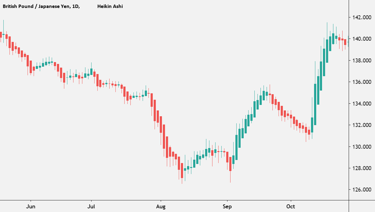
In other words, the Heikin Ashi chart can provide more specific information about the underlying asset within the same time window as the Renko.
Benefits & Drawbacks
Now, let’s take a look at the Renko Chart from both sides. Firstly, let’s review its beneficial sides:
- A filtered and sorted chart.
- Ability to adjust the chart settings of the reversal signals.
- Identification of both support and resistance levels.
- Ability to trail stop-loss for the trades which are based on trends.
- Flexibility of the adjustments: you can use a Renko brick-size calculator to define a right and useful size of the “renga” over a chosen time window.
- You can see the visualisation of the existing cost moving direction by the latest brick color.
However, there are several drawbacks of this instrument:
- The blur of the full picture. Despite the smoothness of the chart – it can misguide because it doesn’t show a clear valuation direction if it is not obvious.
- Less details of the underlying asset price changes.
- Optimal size for previous data doesn’t mean full confidence: Renko bricks still can miss several important cost fluctuations.
- Difficulty. To apply Renko and hope for the best is not the option for a good result. It is a specific type of trading tool which needs to be fully reviewed before the usage and could fit under certain conditions.
Q&A
Adjustment of the Renko Chart to the Thinkorswim
This chart can fit in the Thinkorswim – a popular trading app. Default patterns of candlestick charts can be adjusted under the Renko chart settings.

The path to the adjustment is simple: “Time Axis Settings”, then “Range” from “Aggregation type” and in the end you can pick a “Renko Bars” option. All the next adjustments of the chart are available.
Adjustments for the Tradingview
It is a less complicated way to view our chart, but it is not for free. You have to buy a subscription and only then you choose a “Renko” in the top menu bar. Later on, you can adjust all the specific parameters of the tool.
Setting the Renko Chart’s box size
An optimal size of the brick is directly connected to your own trading strategy: the time frame, risk tolerance and the result you’d like to receive. Smaller “renga” is better for a short-term positioning and, conversely, the larger ones are better for a long-term trade.
